A mental model for understanding responsive CSS units (illustrated with Scheme)
March 8, 2025
We are all familiar with everyday units of measurement like millimeters, centimeters, inches, and others. They are easy to visualize because they represent something tangible in the real world. We know what a centimeter is because it’s defined in absolute terms and we’ve seen it with our own eyes.
In contrast, responsive units are abstract and, therefore, difficult to visualize. We’ve never drawn a line that’s 3 ems long. And we don’t know how tall the Eiffel Tower is in rems.
But there is a mental model that you are likely already familiar with from programming that can make reasoning about responsive units much easier:
CSS responsive units are not really units — they are variables.
First, some definitions
rem stands for “root em” and it refers to the value of the font-size property of the :root element. In most browsers this value is 16px by default but we can set it to anything we like, for example 15px.
em is a unit that originates from typography. It originally referred to the width of a capital letter “M” but in CSS it refers to the font size value inherited by an element from an ancestor according to the rules of the CSS inheritance model. I know this sounds super confusing, but it will hopefully be made clearer as you consider the examples further in this article.
The mental model
Now that we’ve defined rem and em we can see that they are not absolute values of some fixed, known quantity. Instead, they are derived from other values. I like to think of them simply as variables.
So if they are variables then we can express their definitions in a programming language. I think Scheme is great for illustrating this.
Let’s begin with rem. We can define rem in Scheme as follows:
(define rem <font-size of :root>)
If we’ve set the font-size value of the :root element to 15px then it will be:
(define rem 15)
What we’ve done here is we’ve defined a variable called rem that points to the value of the font-size property of the :root element, which in this case is 15.
So all future references to rem in our CSS will evaluate to 15.
Let’s now look at em. We can define em as follows:
(define em <inherited font-size>)
We don’t know what to put instead of <inherited font-size> because it depends on the context. If we are inheriting directly from :root then <inherited font-size> would be 15, but if we are inheriting from some other element whose font-size is 24 then it would be 24. Let’s suppose our element inherits a font size of 24 from an ancestor. Its em variable can then be defined as:
(define em 24)
We can see that while rem points to a specific value on the :root element, em points to some value based on its inheritance context.
So far so good?
Let’s look at some examples
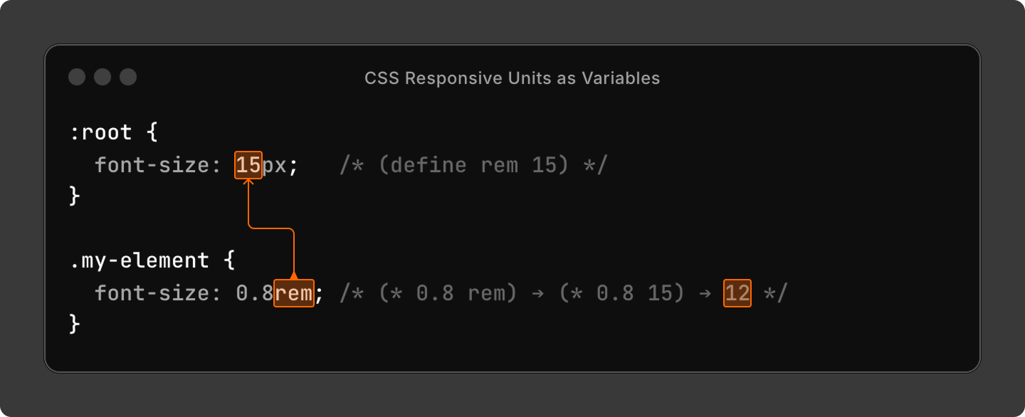
If we look at the ruleset :root { font-size: 15px; } through the prism of our mental model then we will see that what this ruleset is doing is really just:
(define rem 15)
Now that we’ve defined rem, we can use it to dynamically set the font-size of my-element.
The value of font-size in the declaration font-size: 0.8rem; will now evaluate to:
(* 0.8 rem) → (* 0.8 15) → 12
As you can see, what’s great is that now the font-size value of my-element, by nature of using rem which is a variable, is no longer just a static, hard-coded value but a dynamic value; i.e. if we assign a different value to rem at the root then all the calculations that depend on rem will evaluate rem to the new value and, thus, produce different results.
Let’s try it.

If we assign a new value to our rem variable, then this new value will propagate across every declaration that uses rem. Let’s give rem a value of 20:
(define rem 20)
The value of font-size in the declaration font-size: 0.8rem; will now evaluate to:
(* 0.8 rem) → (* 0.8 20) → 16
It’s a bit of a convoluted explanation, but hopefully you can see how the mental model of variables makes it much easier to reason about responsive CSS units.
What about ems?
The same principles apply. Except ems point not to the :root element’s font-size value but to their own inherited font-size value (which is equivalent to pointing to the font-size value of the ancestor providing the inheritance).
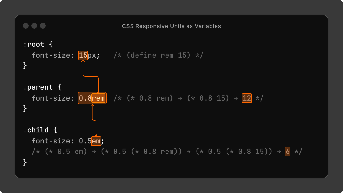
In this example, the parent element is using rem in its font-size declaration and the child element is using em. In this specific inheritance context em will point to the parent element’s font-size value.
We can express this relationship as:
(define rem 15)
(define em (* 0.8 rem))
where child uses em which points to parent which uses rem which points to root.
Thus, the value of font-size in the declaration font-size: 0.5em; will evaluate to:
(* 0.5 em) → (* 0.5 (* 0.8 rem)) → (* 0.5 (* 0.8 15)) → (* 0.5 12) →
6
Conclusion
The goal of these demonstrations is not to show you how to derive exact computed values of CSS declarations, but to illustrate that it is easier to reason about rem and em by seeing them as variables and not measurement units.
You’ve seen that rem and em themselves can be defined in very simple programming terms, however, their interactions within various contexts quickly lead to complexity. By using a mental model of variables we can trace the evaluation of rem and em and more easily debug CSS issues or design desired behaviors.
When we use CSS responsive units we opt into a slightly different mental model than when we use fixed units like px or others. I hope that this article has helped you see this mental model more clearly.
Thoughts or questions? Comment on Bluesky.